Tim Kupers, the owner of the Kallangur Motel, was looking for a local web designer to help him build a new website for his small motel north of Brisbane when he contacted us to do a quote. After having a look at the old website and talking to Tim to see what he wanted to achieve with a new website, we signed them up to our Basic Website Package which included a simple 5 page website but also a new logo design as Kallangur Motel did not have a logo which they used in their promotional materials.
Tim asked for the logo design to be simple but have a nature theme. We went for a green and white colour scheme with some leaves to give the logo a stylish flourish. This logo is now being used in billboards and other forms of advertising for Kallangur Motel.
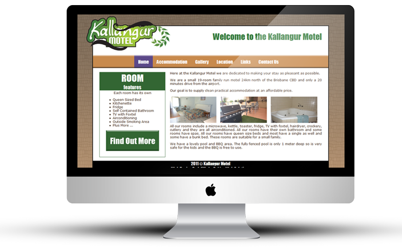
Next we worked on the website design for the motel. We made sure the motel features were prominent in the website design as it is used to try and entice people to book a room. We decided to keep going with the nature theme as we made the website background look like dried mud to complement the logo. With any accommodation website you visit, you want to see pictures so we included a photo gallery which we filled with pictures of the motel rooms and entertainment areas.


